





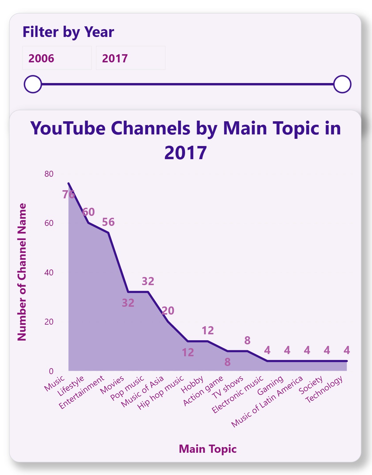
Command TV Typography UI Pattern Library
Font Family: Logo-inspired sans-serif (Montserrat, Poppins, or Nunito)
Logo & Branding Font
Company Logo / Top-Level Headers
Dashboard Header / Hero Title
<h1>Logo / Branding</h1>
700 / Montserrat
Headers & Menus
H1 / Page Title
Primary headers, dashboard top sections
<h1>Page Title</h1>
32px / 700
H2 / Section Title
Subsections
<h2>Section Title</h2>
24px / 600
H3 / Subsection
Minor headings, cards
<h3>Subsection</h3>
20px / 500
Menu Item / Nav
<nav>Menu Item</nav>
16px / 500
Active Menu
<nav class="m_menu-active">Active Menu</nav>
16px / 700
Chart Data / Numbers
Axis Labels
Chart axis labels
<span class="m_axis-label">Axis Label</span>
14px / 400
Data Points
Values on charts
<span class="m_data-point">Data Point</span>
12px / 500
Tooltip
Information on hover
<span class="m_tooltip">Tooltip</span>
12px / 400
Body Text / UI Elements
Body Text
Main content text in forms, paragraphs, and UI elements.
<p>Body Text</p>
16px / 400
Subtext / Caption
Helper text, captions, or secondary information.
<p class="m_subtext">Subtext</p>
14px / 400
Buttons / Labels
<button>Label</button>
16px / 500
Primary Branding Colors
Primary
#3B118D
Core brand color — buttons, key actions, headers
Secondary
#8D1179
Supporting color — secondary buttons, accents
Accent
#B35FA8
For small highlights, notifications, hover states
Soft Pastel Variants (Website Friendly)
Primary Light
#7B66C4
Buttons, banners, links
Secondary Light
#C17BAF
Subtle cards, backgrounds
Accent Light
#E3BFE0
Highlights, hover states
Background
#F7F2FA
Website page backgrounds
Neutral & Text Colors
Text Primary
#1A1625
Main headings, body text
Text Secondary
#4A4A6A
Secondary text, captions
Border / Divider
#D9D9E0
Card borders, dividers
Disabled
#BDB7CE
Disabled buttons, placeholders
Feedback / State Colors
Success
#6FCF97
Success messages, status
Warning
#F2C94C
Alerts, warnings
Error
#E35858
Error messages, form validation
Info
#56CCF2
Informational states
Chart / Data Visualization Colors
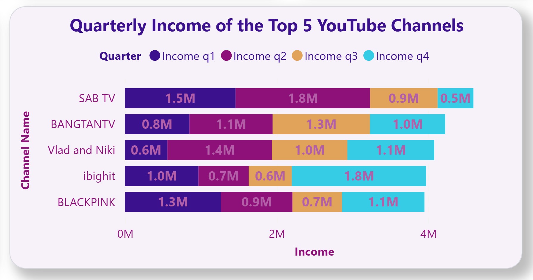
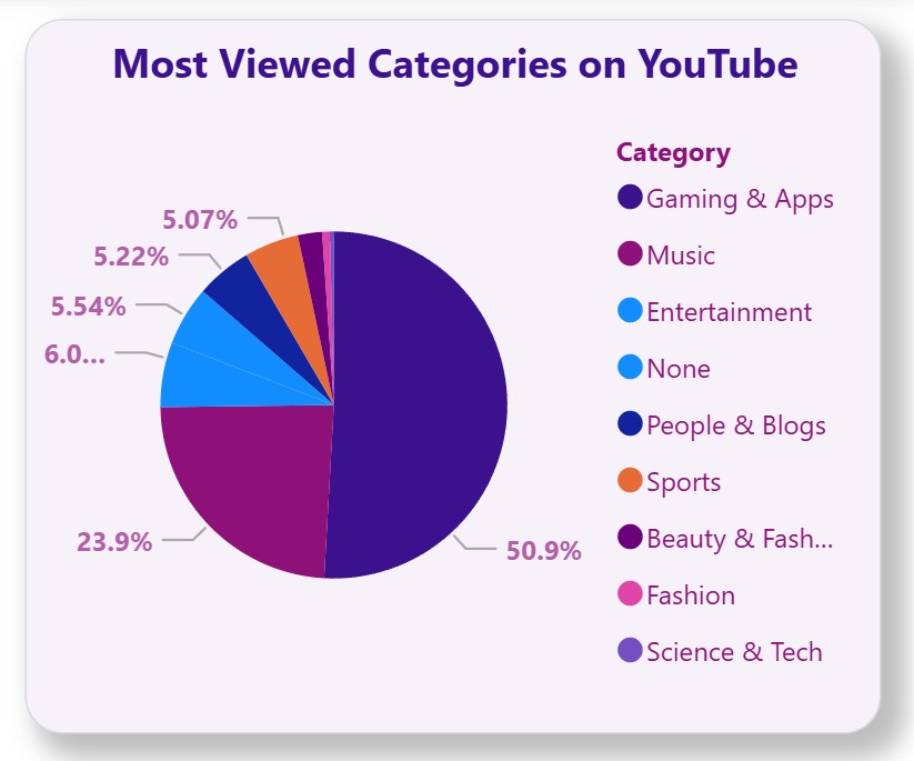
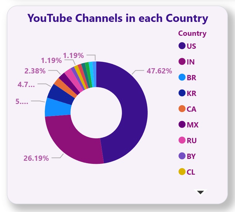
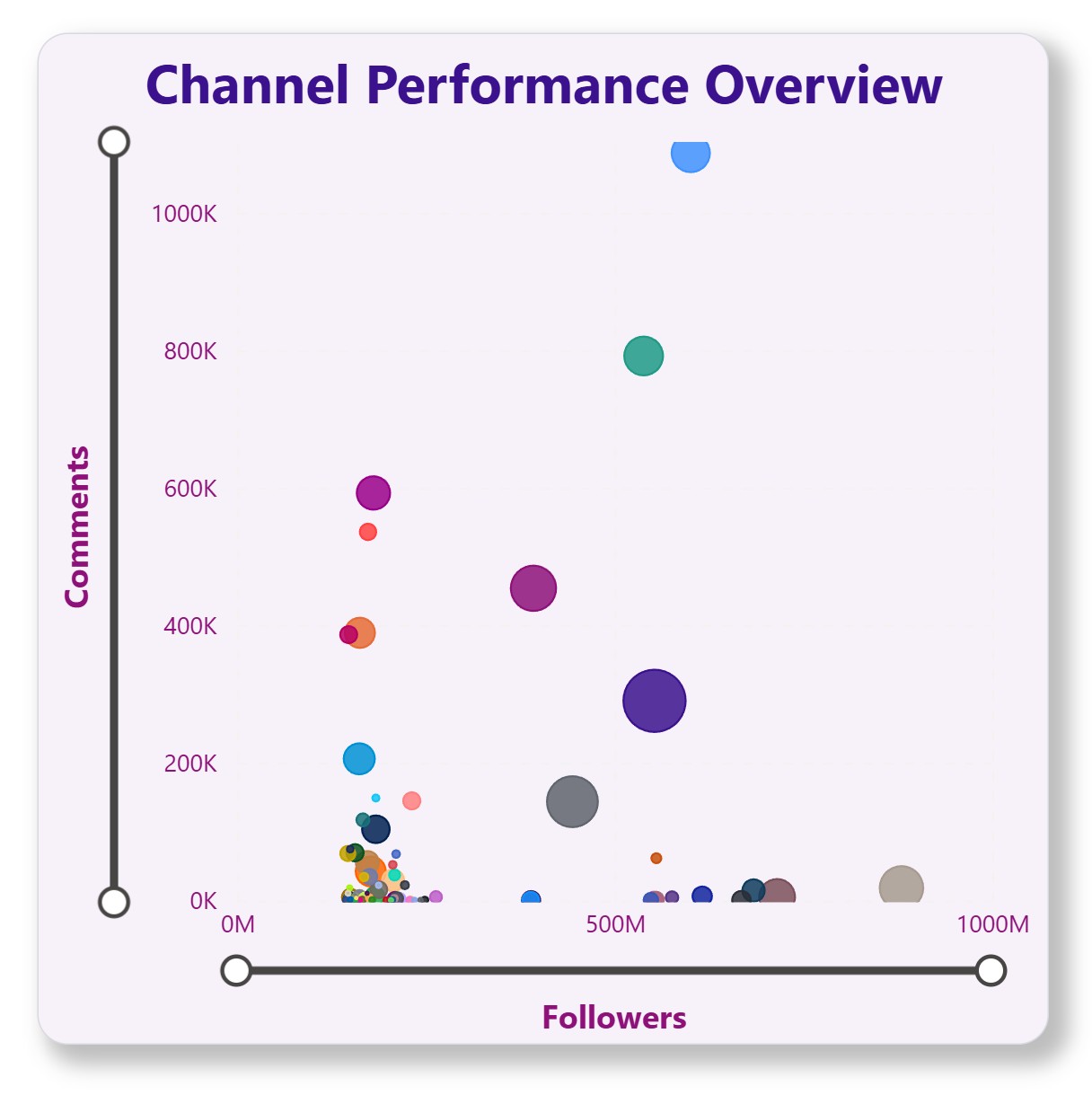
Use highlighted colors sparingly (brand colors for key data points). Use muted or pastel tones for other elements.
Highlight 1
#3B118D
Key data points
Highlight 2
#8D1179
Secondary highlights
Highlight 3
#B35FA8
Accent highlights
Neutral 1
#F3F1FA
Primary Background
Neutral 2
#D9D9E0
Secondary Background
Optional Fun / Playful Accent Colors
For buttons, badges, or micro-interactions reflecting playfulness & excitement.
Fun Pink
#F28A8A
Playful tone
Fun Teal
#56CCF2
Refreshing, energetic
Fun Yellow
#F2C94C
Bright, cheerful highlights
Buttons
<button class="h_btn-primary">Primary Button</button>
<button class="h_btn-secondary">Secondary</button>
<button class="h_btn-outline">Outline</button>
<button class="h_btn-ghost">Ghost</button>
<button class="h_btn-destructive">Destructive</button>
<button class="h_btn-link">Link</button>
/* Primary button */
.h_btn-primary {
	background-color: #3b118d;
	color: white;
}

.h_btn-primary:hover {
	background-color: #725fa8;
	transform: translateY(-1px);
}

/* Secondary button */
.h_btn-secondary {
	background-color: #8d1179;
	color: white;
}

.h_btn-secondary:hover {
	background-color: #bf81a6;
	transform: translateY(-1px);
}

/* Outline button */
.h_btn-outline {
	background-color: #f7f2fa;
	color: #1a1625;
	border: 1px solid #3b118d;
}

.h_btn-outline:hover {
	background-color: #3b118d;
	color: white;
}
/* Ghost button */
.h_btn-ghost {
	background-color: transparent;
	color: #1a1625;
	border: none;
}

.h_btn-ghost:hover {
	background-color: #f3f1fa;
	color: #725fa8;
	transform: translateY(-1px);
}

/* Destructive button */
.h_btn-destructive {
	background-color: #e35858;
	color: white;
}

.h_btn-destructive:hover {
	background-color: #d73f3f;
	transform: translateY(-1px);
}

/* Link button */
.h_btn-link {
	background-color: transparent;
	color: #3b118d;
	border: none;

	padding: 8px 12px;
}

.h_btn-link:hover {
	color: #725fa8;
	text-decoration: none;
	background-color: transparent;
	transform: none;
	text-decoration: underline;
}

.h_btn-link:focus {
	outline: 2px solid #3b118d;
	outline-offset: 2px;
}
<button class="h_btn-primary h_btn_sm">Small</button>
<button class="h_btn-primary">Default</button>
<button class="h_btn-primary h_btn_lg">Large</button>

.h_btn_sm {
	padding: 8px 16px;
}
.h_btn_lg {
	padding: 12px 24px;
}
Form Inputs
<input type="text" id="defaultInput" placeholder="Enter text..." />
<input type="text" id="disabledInput" placeholder="Disabled..." />
<textarea type="text" id="textArea" placeholder="textarea for long content..."></textarea>
input {
	border: none;
	outline: none;
	background: transparent;
	border-bottom: 2px solid #d9d9e0;
	padding: 12px 4px;
	font-family: "Poppins", sans-serif;
	font-size: 16px;
	transition: border-color 0.3s ease;
}
input:focus {
	border-bottom: 2px solid #3b118d;
}
input::placeholder {
	color: #bdb7ce;
}

textarea {
	border: none;
	outline: none;
	background: transparent;
	border-bottom: 2px solid #d9d9e0;
	padding: 12px 4px;
	font-family: "Poppins", sans-serif;
	font-size: 16px;
	line-height: 24px;
	resize: vertical;
	min-height: 60px;
}
textarea:focus {
	border-bottom: 2px solid #3b118d;
}

textarea::placeholder {
	color: #bdb7ce;
}
Selections
Checkboxes
<input class="form-check-input h_checkbox" type="checkbox" id="checkedOption" checked />
<label class="form-check-label" for="checkedOption">Checked Option</label>

<input class="form-check-input h_checkbox" type="checkbox" id="unCheckedOption" />
<label class="form-check-label" for="unCheckedOption">Unchecked Option</label>

<input class="form-check-input h_checkbox" type="checkbox" id="disabledOption" disabled />
<label class="form-check-label text-disabled" for="disabledOption">Disabled Option</label>

<input class="form-check-input h_checkbox" type="checkbox" id="disabledCheckedOption" checked disabled />
<label class="form-check-label text-disabled" for="disabledCheckedOption">Disabled Checked</label>

	/* checkboxes */
input[type="checkbox"] {
	padding: 2px;
}

.h_checkbox {
	width: 18px !important;
	height: 18px !important;
	border: 1px solid #d9d9e0 !important;
	border-radius: 3px !important;
	background-color: white !important;
	cursor: pointer !important;
	transition: all 0.3s ease !important;
	background-image: none !important;
}

.h_checkbox:hover {
	border-color: #725fa8 !important;
}

.h_checkbox:checked {
	background-color: #3b118d !important;
	border-color: #3b118d !important;
	background-image: url("data:image/svg+xml,%3csvg xmlns='http://www.w3.org/2000/svg' viewBox='0 0 20 20'%3e%3cpath fill='none' stroke='%23fff' stroke-linecap='round' stroke-linejoin='round' stroke-width='3' d='M6 10l3 3l6-6'/%3e%3c/svg%3e") !important;
}

.h_checkbox:focus {
	box-shadow: 0 0 0 0.25rem rgba(59, 17, 141, 0.25) !important;
}

.h_checkbox:disabled {
	background-color: #f3f1fa !important;
	border-color: #bdb7ce !important;
	cursor: not-allowed !important;
	opacity: 1 !important;
}

.h_checkbox:disabled:checked {
	background-color: #bdb7ce !important;
	border-color: #bdb7ce !important;
}

.form-check-label {
	font-family: "Poppins", sans-serif !important;
	font-size: 16px !important;
	color: #1a1625 !important;
	cursor: pointer !important;
}

.text-disabled {
	color: #bdb7ce !important;
}
Radio Buttons
<input type="radio" id="opt1" checked name="opt" value="1"
		class="form-check-input h_radio" />
<label for="opt1" class="form-check-label">Option1</label>

<input type="radio" id="opt2" name="opt" value="2"
		class="form-check-input h_radio" />
<label for="opt2" class="form-check-label">Option2</label>

<input type="radio" id="opt3" name="opt" value="3"
class="form-check-input h_radio" />
<<label for="opt3" class="form-check-label">Option3/<label>

input[type="radio"] {
	padding: 2px;
	border: 1px solid #d9d9e0;
}

.h_radio {
	width: 10px !important;
	height: 10px !important;
	border: 1px solid #d9d9e0 !important;
	border-radius: 50% !important;
	background-color: white !important;
	cursor: pointer !important;
	transition: all 0.3s ease !important;
	background-image: none !important;
	appearance: none !important;
}

.h_radio:checked {
	background-color: #3b118d !important;
	border-color: #3b118d !important;
}

.h_code_review {
	width: 90%;
	display: block;
	overflow: auto;
	height: 500px;
}
Switch
<input class="form-check-input h_switch"
					type="checkbox"
					role="switch"
					id="switchCheckChecked"
					checked />
<label class="form-check-label" for="switchCheckChecked">switch components</label>
/* switch */
.h_switch {
	width: 48px !important;
	height: 24px !important;
	border-radius: 12px !important;
	background-color: #d9d9e0 !important;
	border: none !important;
	cursor: pointer !important;
	transition: all 0.3s ease !important;
	background-image: none !important;
	position: relative !important;
}

.h_switch:checked {
	background-color: #3b118d !important;
}

.h_switch:focus {
	box-shadow: 0 0 0 0.25rem rgba(59, 17, 141, 0.25) !important;
}

.h_switch::before {
	content: "";
	position: absolute;
	width: 20px;
	height: 20px;
	border-radius: 50%;
	background-color: white;
	top: 2px;
	left: 2px;
	transition: transform 0.3s ease;
	box-shadow: 0 1px 3px rgba(0, 0, 0, 0.2);
}

.h_switch:checked::before {
	transform: translateX(24px);
}
Badges
Primary
Secondary
Error
Success
Info
Warning
Outline
<span class="badge bg-primary">Primary</span>
<span class="badge bg-secondary">Secondary</span>
<span class="badge bg-error">Error</span>
<span class="badge bg-success">Success</span>
<span class="badge bg-info">Info</span>
<span class="badge bg-warning">Warning</span>
<span class="badge h_outline_badge">Outline</span>
.h_outline_badge {
	color: #1a1625;
	border: 1px solid #d9d9e0;
}
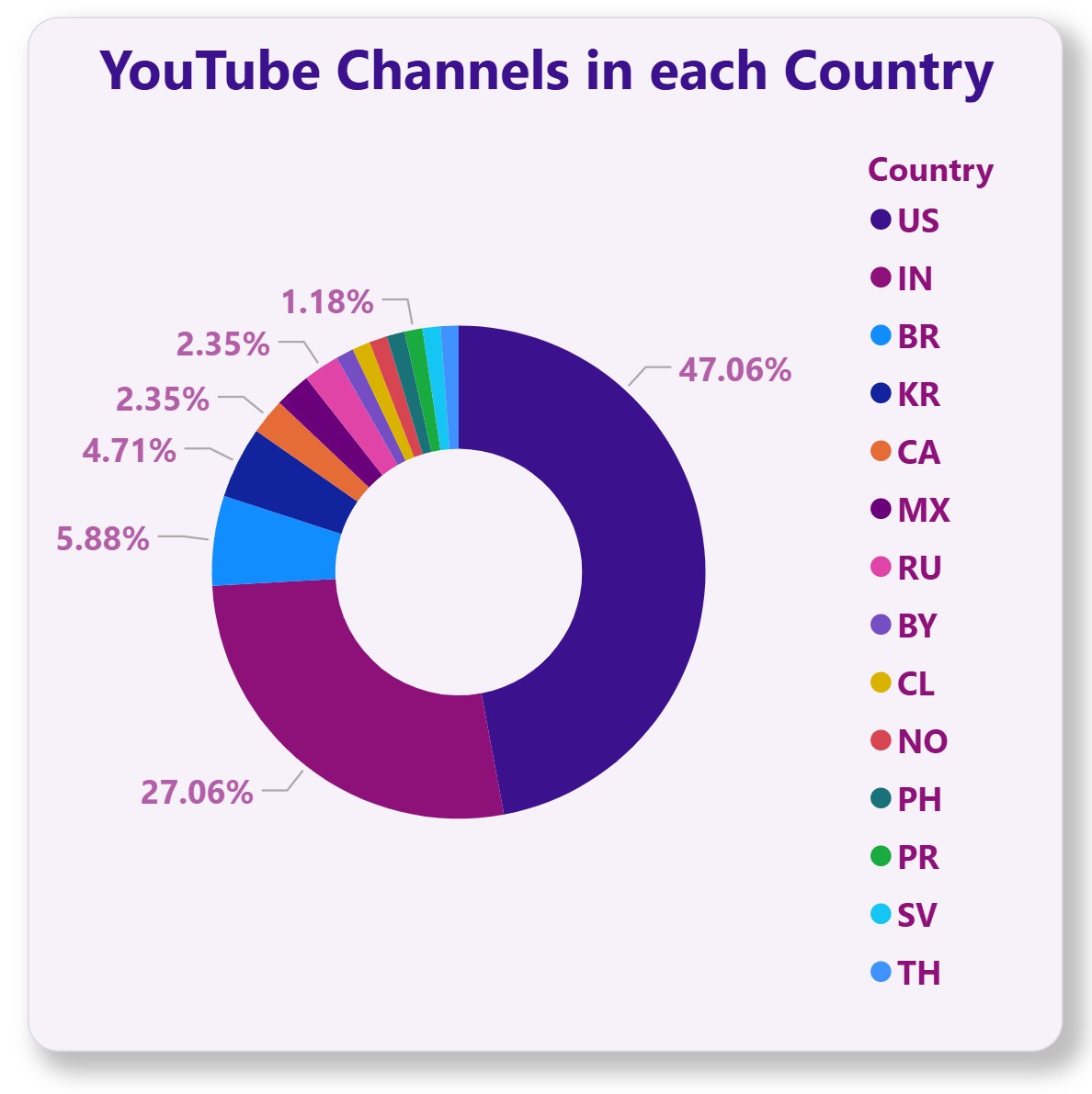
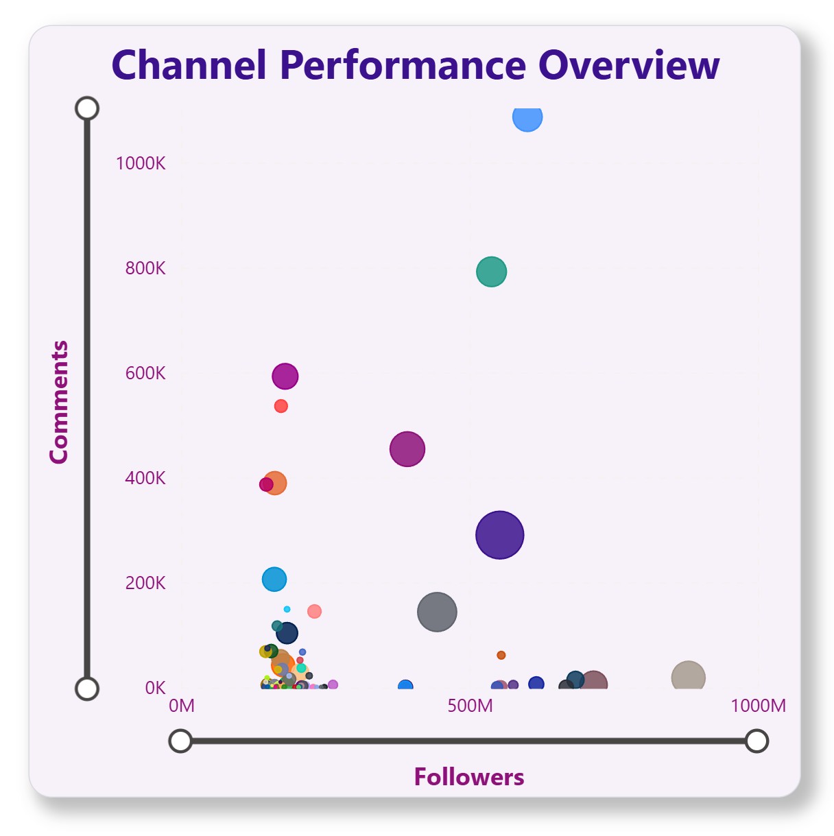
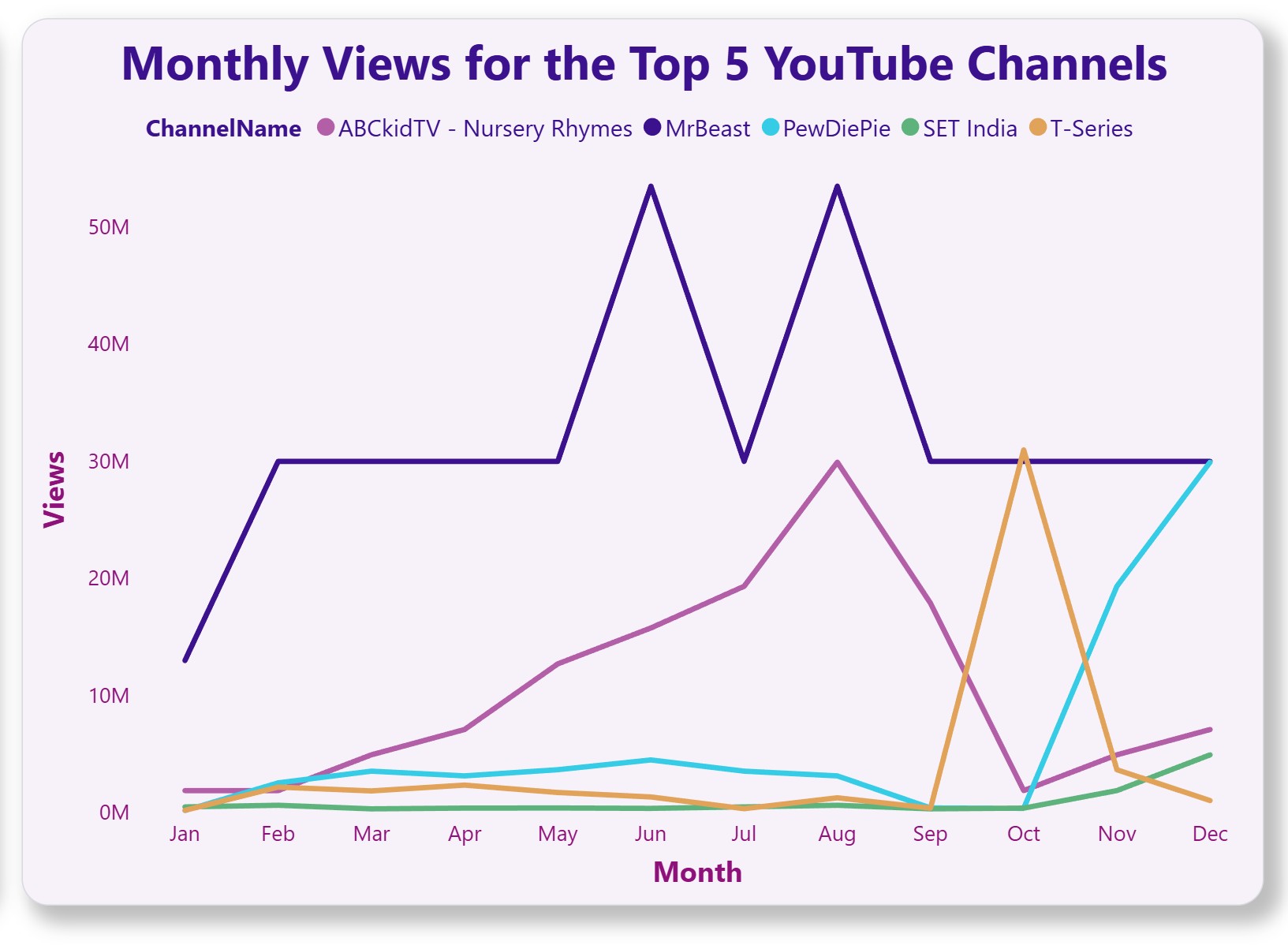
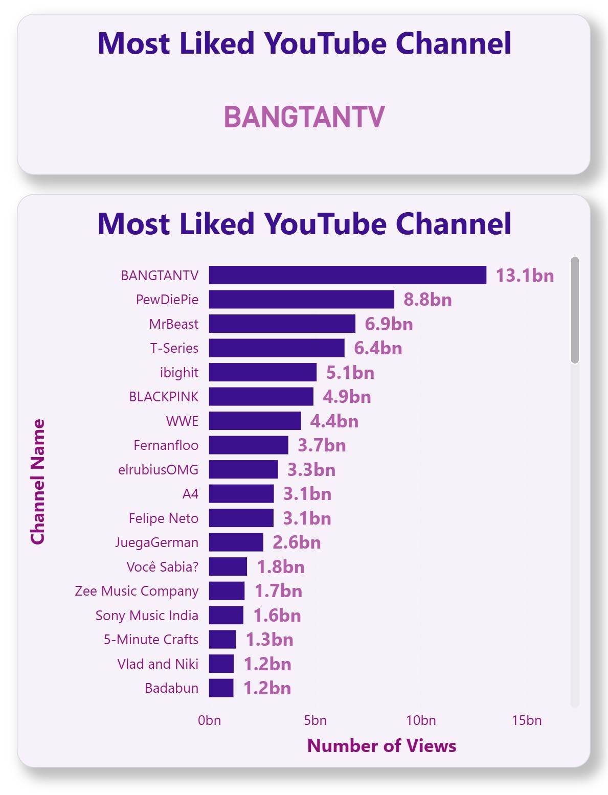
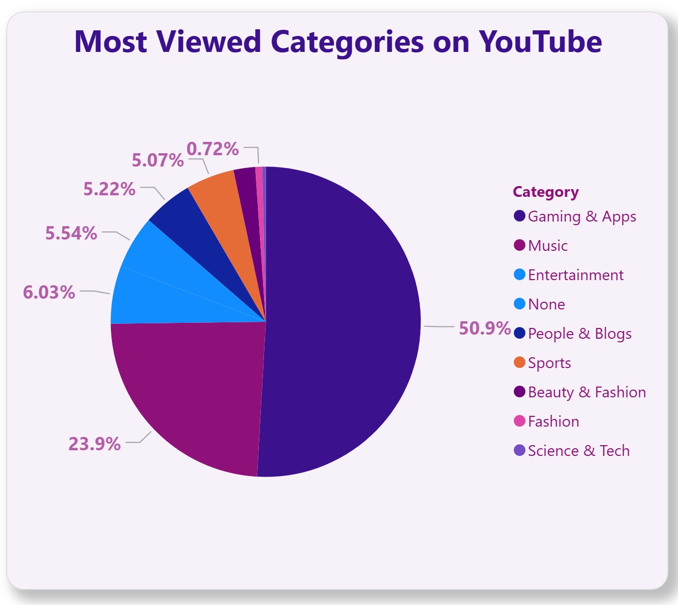
Customer requirement: I want grid boxes to have shadows
Grid box with shadows
Grid box with shadows
Grid box with shadows
Grid box with shadows
Grid box with shadows
Grid box with shadows